Overview
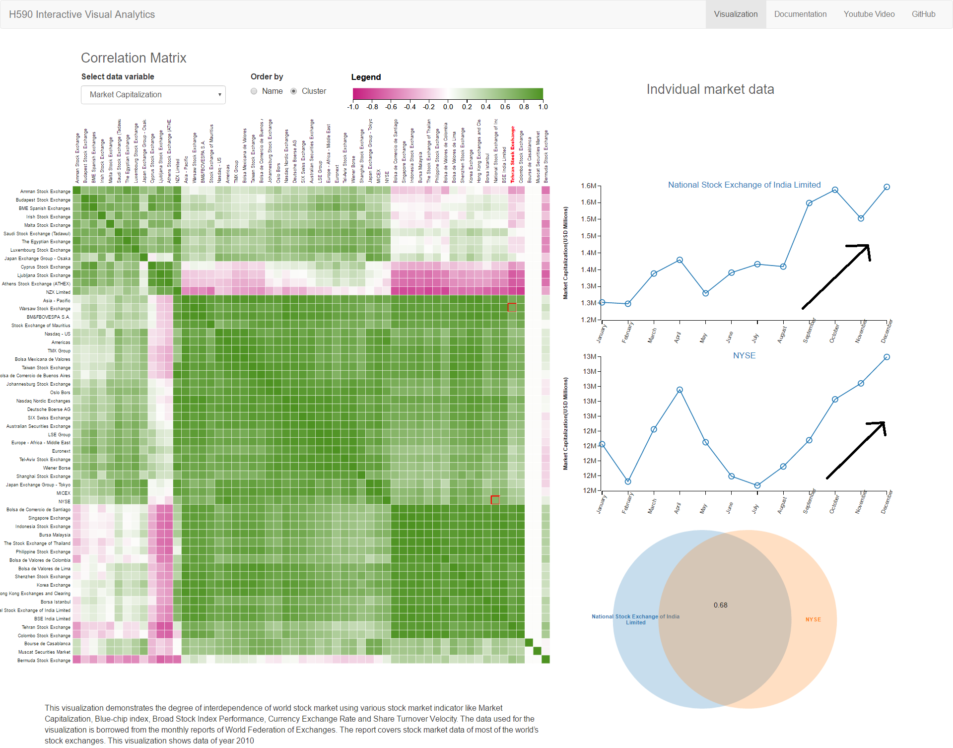
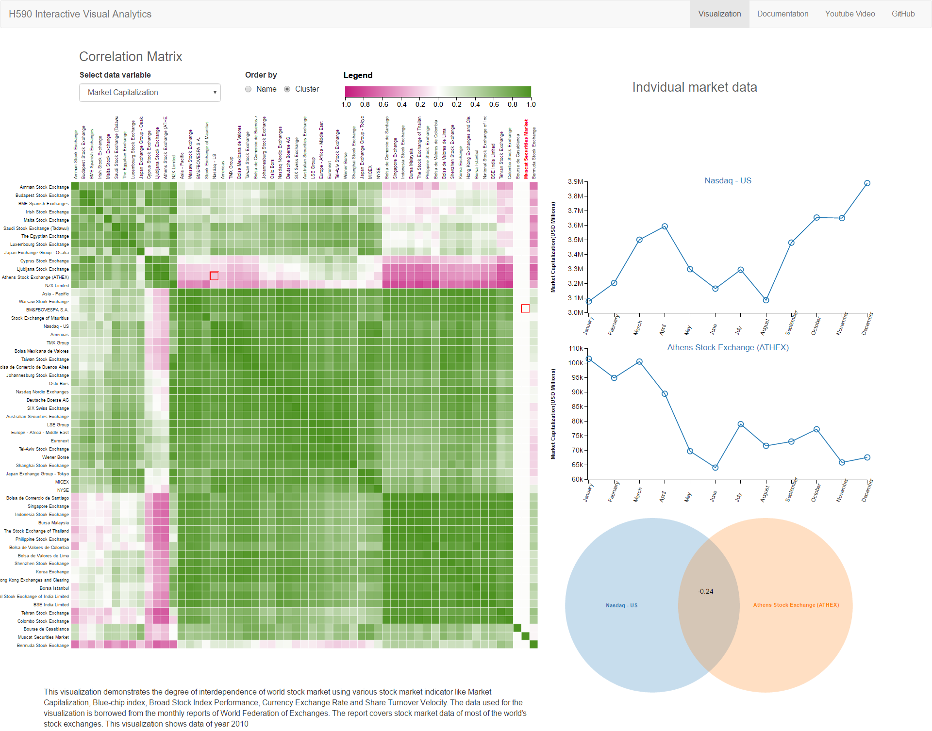
This visualization demonstrates the degree of interdependence of world stock market using various stock market indicator like Market Capitalization, Blue-chip index, Broad Stock Index Performance, Currency Exchange Rate and Share Turnover Velocity. The data used for the visualization is borrowed from the monthly reports of World Federation of Exchanges. The report covers stock market data of most of the world’s stock exchanges. This visualization shows data of year 2010.
The visualization uses Pearson correlation coefficient to find degree of correlation between two chosen stock in the matrix. The correlation co-efficient value oscillates between -1 to +1. If the value is -1 the correlation is negative and if its +1 it can be assumed that there is positive correlation and two stock market, follow each other. On the other hand, if the correlation is 0, it means two stock market not dependent on each other and we can’t establish relationship between them. The visualization represents negative values in red color and positive values with the green color in correlation matrix.
Additionally, visualization can cluster strongly related markets based on their correlation coefficient. The visualization also show trend line when clicked on any cell in the matrix along with Venn diagram to visualize the degree and form of the interdependence.
Visualization show that, emerging markets move together with markets of developed countries up to some extent. This information can be used by investor in diversifying their portfolio to hedge the potential risk in the market. It can also be used by the economists to predict domino effect if any one of the market takes hit.
Design Process
Design process began with collecting and analyzing nature of data. As data was in excel format and had many more indicator than what we were interested. We had to clean data and create comma separated file from the monthly excel report of World Federation of Exchanges.
Once we had data we began brainstorming best ways to find the correlation from the raw data. We came across the Pearson Correlation Co-efficient (PCC) which deduce the correlation between two sets of data. This co-efficient was idle for our problem statement. We decided to utilize the PCC.
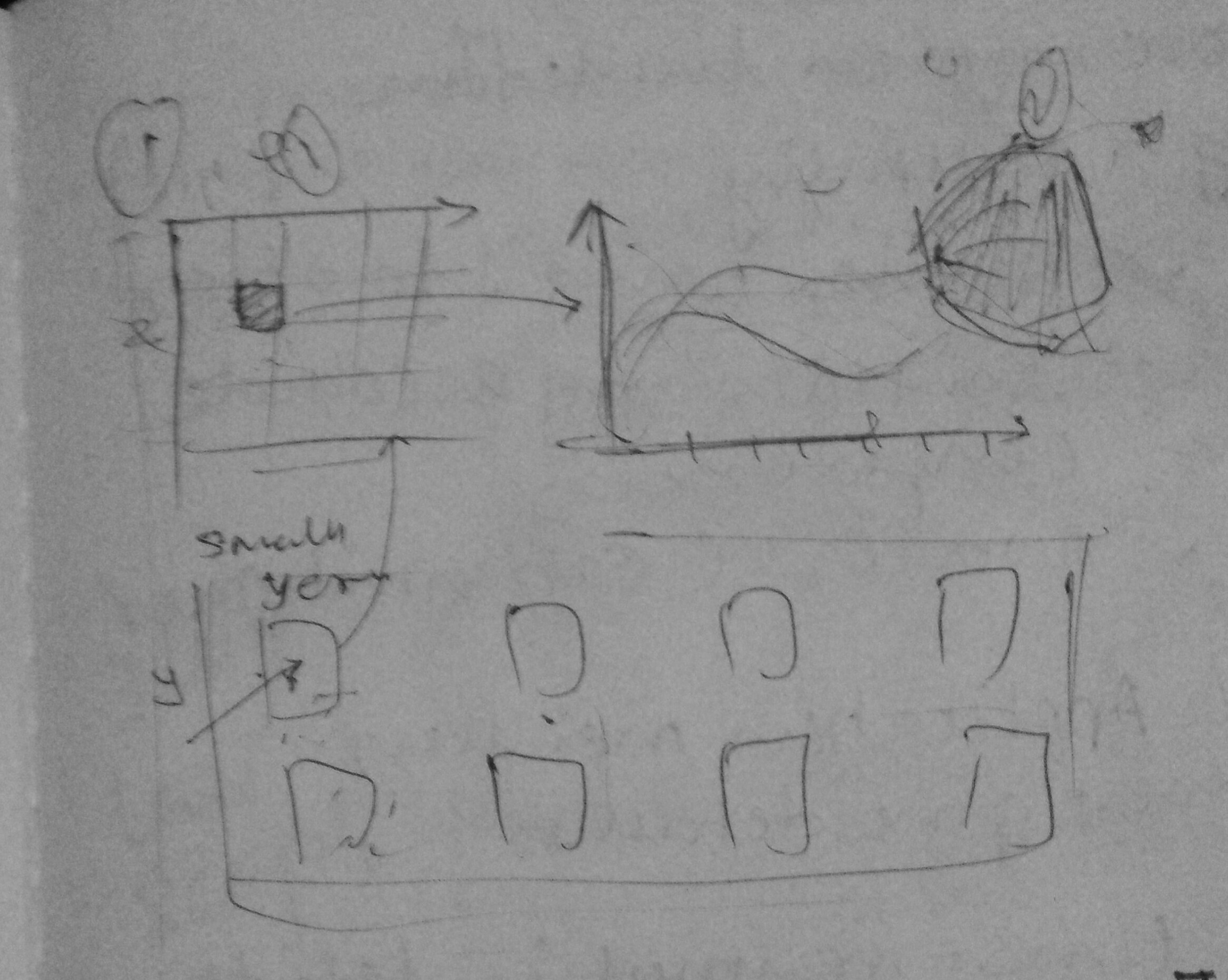
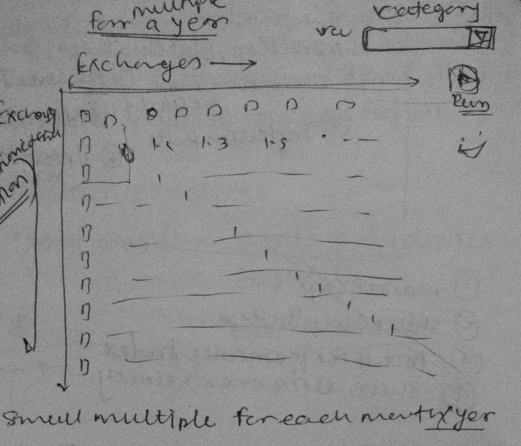
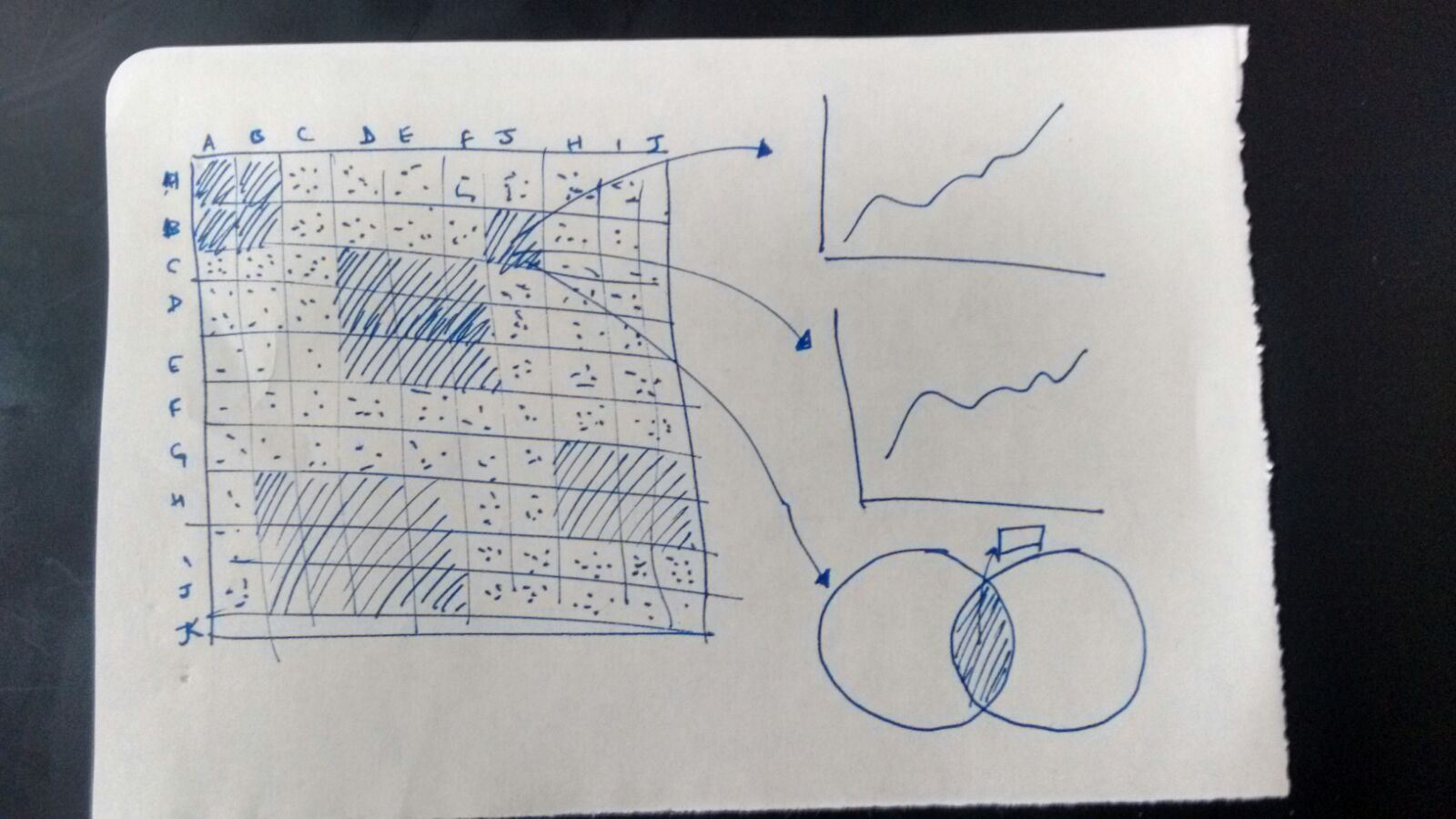
The next challenge was to effectively show the PCC values between two stock exchange and individual stock market indicator trend over the year. We started brainstorming various ideas like parallel co-ordinate, word map etc. but at the end we settled with the Correlation matrix, Time series line graph and Venn diagram. Correlation matrix best represent relation between two variables in the array of variables.
Design Decisions
-
Correlation Matrix Heat map:The number of stock exchanges and their relationship with every other stock market yields to large amount data and matrix were natural choice for such visualization.
Color for showing degree of correlation is represented by the green and red color. Greener the cell higher the correlation and red the cell inverse the relationship. There was critical design decision made to show element with no correlation with white color to separate out them from rest of cells.
Trend of Stock Market: Visualization aids user with trend of actual market indicator value for selected cell.
Venn Diagram: It is additional visual cue to reinforce the degree of correlation with visual instead of number and color. It utilizes the circles, if two circle overlap each other it means that they have positive correlation and vice versa.
Insights
-
NYSE and Nation stock Exchange Small multiple across various parameter showing positive relation
-
NYSE maintains positive relationship with most of world market showing other market react in same
manner to the movement of New York Stock Exchange

- American, Asian, European and Middle East shows group movement and maintain positive correlation among themselves.
-
Athens Stock Market consistently shows negative correlation with the American stock market like NYSE
and NASDAQ
FAQ
- What is the 'Correlation Coefficient’?
The correlation coefficient is a measure that determines the degree to which two variables' movements are associated. The range of values for the correlation coefficient is -1.0 to 1.0. If a calculated correlation is greater than 1.0 or less than -1.0, a mistake has been made. A correlation of -1.0 indicates a perfect negative correlation, while a correlation of 1.0 indicates a perfect positive correlation. Read More - What is 'Market Capitalization’?
Market capitalization refers the total dollar market value of a company's outstanding shares. Commonly referred to as "market cap," it is calculated by multiplying a company's shares outstanding by the current market price of one share. The investment community uses this figure to determine a company's size, as opposed to using sales or total asset figures Read more - What is the 'Blue-Chip Index' ?
The blue-chip index is a stock index that tracks the shares of the top-performing publicly traded companies. Blue-chip stocks represent companies that are financially stable, well established and provide good returns for investors, making them desirable investments. Because blue-chip companies tend to perform similarly to the economy the performance of a blue-chip index may be considered a gauge of an industry's or region's economic strength. It is for this reason that news reports typically mention how a major blue-chip stock index, such as the Dow Jones Industrial Average (DIJA), performed that day. Read More - What is ‘Broad Stock Index Performance’?
Broad indexes are, in general, market capitalization-weighted, including a large sample of listed domestic companies, as the all-share or composite indexes. They are generally recalculated to adjust to capital operations and to modifications in the company composition of the index. The index can be market capitalization-weighted or free float based. - What is ‘Share Turn Over Velocity’?
The turnover velocity is the ratio between the Electronic Order Book (EOB) turnover of domestic shares and their market capitalization. The value is annualized by multiplying the monthly average by 12. Share turnover is a measure of stock liquidity calculated by dividing the total number of shares traded over a period by the average number of shares outstanding for the period. The higher the share turnover, the more liquid the share of the company. Read More - What is 'International Currency Exchange Rate’?
The rate at which two currencies in the market can be exchanged. International currency exchange rates display how much of one unit of a currency can be exchanged for another currency. Currency exchange rates can be floating; in which case they change continually based on a multitude of factors. Alternatively, the exchange rates of some foreign currencies are pegged, or fixed, to other currencies, in which case they move in tandem with the currencies to which they are pegged. Read More